|
Accordion |
  
|
|
Accordion |
|
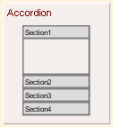
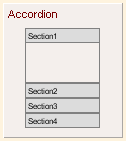
Accordion is a basic element, besides in the Hand Drawing theme, its appearance doesn't change for other UI themes.
UI Theme: |
Hand Drawing |
Other Themes |
Legend |
|
|
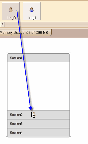
Accordion is a container element, each section of Accordion can accept elements. You can drag element into Accordion's section with right mouse button hold or Ctrl key pressed.
Double clicking the Accordion can edit the titles for all sections.
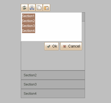
Each row is for one section. Adding more rows will add more sections into accordion as well. Removing certain rows will also remove the corresponding sections. If a section is removed from accordion and no other section can accept its embedded content, it will extract its embedded elements to plot before the deletion.
Accordion can accept images at its section headers. You can drag image from image dock to Accordion's section header directly, thus you can change the icon for each section header.
Element Specific Facilities
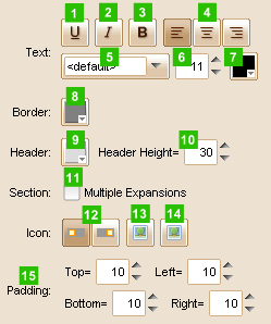
| 1. | Underline the text |
| 2. | Make text italic |
| 3. | Use bold text |
| 4. | Align of the text (left, center, right) |
| 5. | Font of the text |
| 6. | Text size |
| 7. | Text color |
| 8. | Border color |
| 9. | Header background color |
| 10. | Header height ( in pixels ) |
| 11. | Whether to allow multiple sections be expanded at a time |
| 12. | Placement of the icon in header (left or right) |
| 13. | Set icons for all collapsed sections |
| 14. | Set icons for all expended sections |
| 15. | Set padding for section area |
Element Events
Element Clicked, Element Double-Clicked, Element Right-Clicked, Element Initialized, Element Hidden, Mouse Over, Mouse Out, Mouse Move, Mouse Down, Mouse Up, Global Mouse Move, Global Mouse Down, Global Mouse Up, Key Down, Key Up, Custom Event, Section Expanded/Collapsed
Element Actions
Change Visibility, Change Location, Set Section Title, Change State
Element Properties
Id, X Coordinate, Y Coordinate, Width, Height, Visible, Note
Accordion Section Count, Section Expand Flags, Index of First Expanded Section