ForeUI will not have any boring document (except optional daily tips).
So the context menu in plot area is also the document of the hotkeys 🙂
Archive for February, 2009
A friend introduce me an interesting L&F named “Napkin”, it is really wonderful and I think there is a very good point: a demo should looks like a demo. My understanding is that in some cases, a demo should not look “too” pretty, or it may let people think it was not a demo.
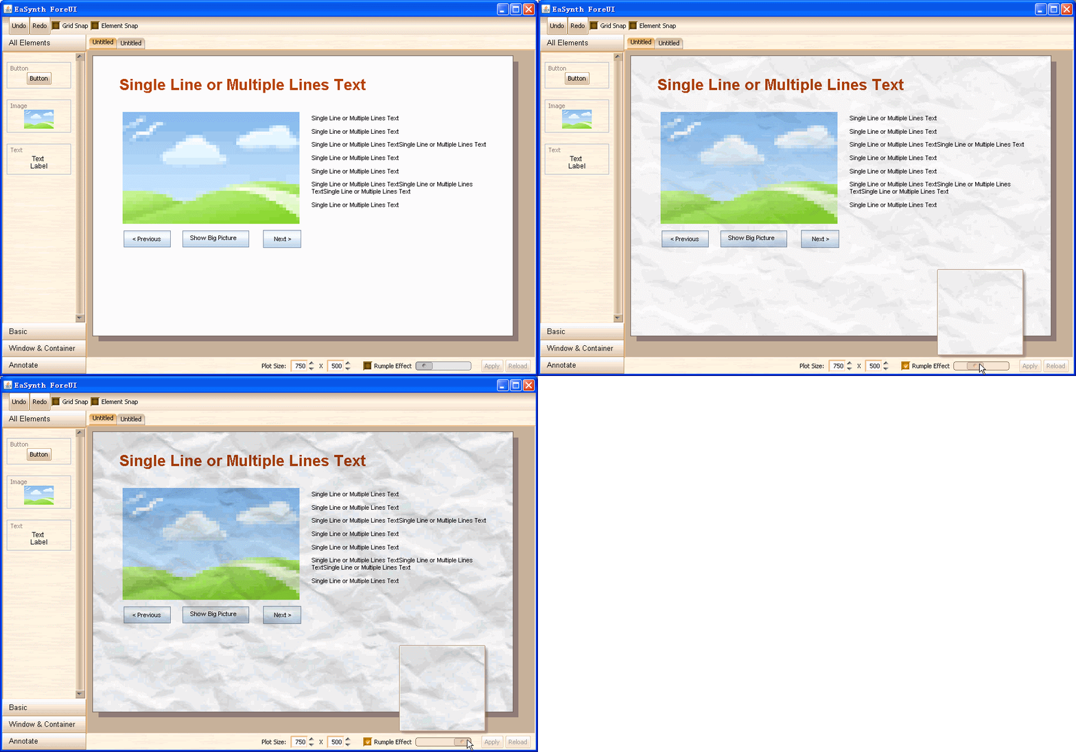
We think ForeUI should have something like Napkin, which make the mockup “uglier”. Also we know it is not always necessay to do that, so we just add an optional featured: Rumple Effect.
Today the plot info bar is implemented, and the rumple effect is also integrated into the bar, here is the result:
We have to hold ForeUI project for a week, and now it is resumed.
Actually in the last ten days, we were assigned to work for the update 5 of designer and EaSynth L&F v1.05. That is a big update, and I am pleased to see EaSynth L&F support the shadow effect in combo box now, so ForeUI can have a more consilient UI style.
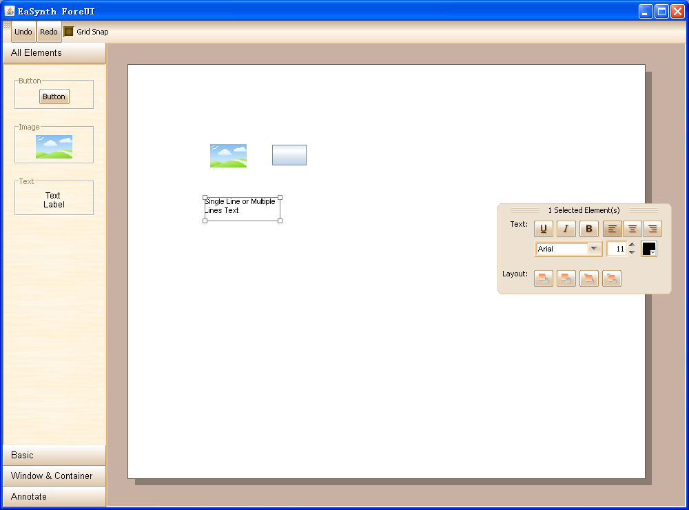
We refactor the source code, a lot, in order to achieve a better user experience. In details, We improved the element selecting, moving and resizing behavior, which are the most frequently used features, and will significantly affact the UX.
There is no new feature implemented in the last two days, but we think the drag and drop framework is more important than that. We set the best user experience as our goal.

