I’ve just submitted a new version of iPhone app mockup library in the community site. This version contains 28 elements for iPhone app wireframing.
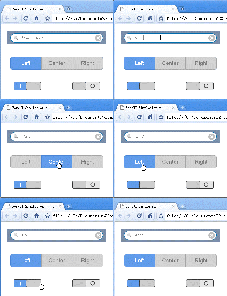
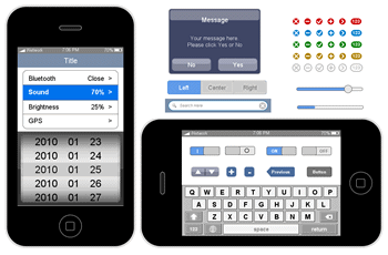 Title bar, search bar, slider, progress bar, tabs… All these new elements are very useful for creating iPhone app mockup. Some of them are even interactive, which means you can interact with them in the DHTML simulation.
All elements in this library are created with some basic elements in ForeUI. You can create your own element, even the interactive element can be defined by adding a few event handlers.
Download the Library
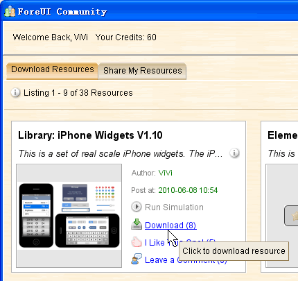
You can download the library in ForeUI, just click the “Resource Sharing” button on bottom left corner to open the community window:
Then you can download the library by clicking the “Download ” link, as shown in figure below:
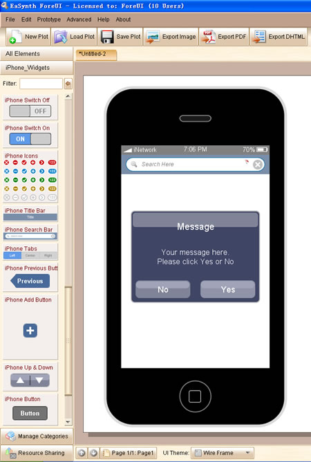
The library will be deployed automatically after the downloading, and you will find a new “iPhone_Widgets” element category on the left of ForeUI window. Then you can use the new elements inside for iPhone app wireframing.
Also you can download the library from our community website, but you would need to deploy it by yourself, the .fcl is a ZIP file, which contains 28 .fce files inside.
Create Mockup for iPhone App
Using the new iPhone elements is quite easy, just drag the elements from the left list into the editing area. Nothing different than using other elements.
Actually we can use these iPhone elements to create two kinds of mockups for iPhone app:
- iPhone mockup with “app running inside”. The iPhone shell will be included in the mockup. The simulation can be run on any device with web browser.
- App mockup without iPhone shell. The mockup can be run in iPhone web browser to simulate a “real” running app.
The difference is whether to include the iPhone shell. The mockup without iPhone shell allows you to run the 1 : 1 simulation on iPhone, which provides the experience that close to the real app.
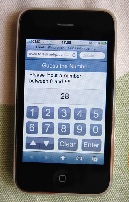
Recently I’ve created an interesting mockup for a “Guess the Number” game in iPhone, you can also find it in the community window or here. If you run its simulation on PC, you will see the simulation like this:
It’s cute since you can really play with it, although it doesn’t look like an iPhone app. But if you launch the simulation in iPhone web browser, things become much more interesting, you can really play the “app” on your iPhone!
Want to try it on your iPhone? That’s easy, if you are browsing this page with iPhone, just click here to launch the simulation.
Something need to mention:
- Since the mockup is running in web browser, it seems not possible to get rid of the navigation bar on top and the status bar on bottom, but scrolling up a little bit can move the navigation bar out of screen.
- Although the resolution of iPhone is 320 x 480, the navigation bar and status bar take about 120 pixels height, so the actual mockup size is 320 x 360.
Here I am showing an extreme example, not only the GUI but also the logic of the game is simulated in the mockup. In actual cases, you need to make a compromise between the mockup details and the workload of prototyping.
