A friend introduce me an interesting L&F named “Napkin”, it is really wonderful and I think there is a very good point: a demo should looks like a demo. My understanding is that in some cases, a demo should not look “too” pretty, or it may let people think it was not a demo.
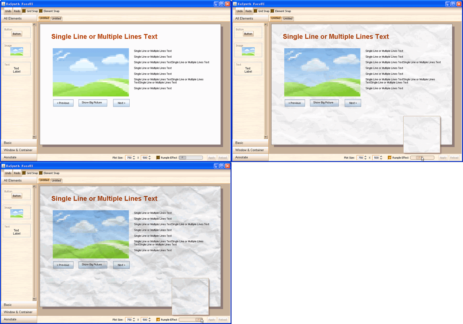
We think ForeUI should have something like Napkin, which make the mockup “uglier”. Also we know it is not always necessay to do that, so we just add an optional featured: Rumple Effect.
Today the plot info bar is implemented, and the rumple effect is also integrated into the bar, here is the result:
